

UX/UI
There has been a continuing need for the automation of processes and forms within government HR, where paper forms and manual processes are abounding. We started creating a much smaller feature to address this need, but eventually we thought this could become its own product.
This project is still a work in progress, but here's the journey so far!
Project
Process Builder
Date
Fall 2017 - Present
Client
Neogov
Context
Neogov is the #1 HR SAAS company within the public sector. Its main suite of products focus on applicant tracking, employee onboarding, and performance evaluation, but they are quickly adding more products to cover the entire gamut of HR needs.
The process builder started out just being a small feature in our larger Onboard product that could create a checklist of tasks and schedule it to be assigned periodically. But as we continued working on it, we realized that it could be so much bigger than just a scheduled checklist.
Objective
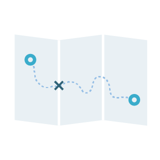
In particular, the FMLA (Family and Medical Leave Act- a federal law that allows certain employees to take up to 12 weeks off unpaid leave) was a big point of inspiration for us. If you haven’t seen the process that people need to go through to determine whether they’re eligible or not, see below:

As you can imagine, this involves a ton of paperwork, keeping track of how much time has passed, and back-and-forth between the employee and HR. We wanted to build a workflow builder that would be powerful enough to accommodate such a complex process but simple enough to be used by our not-as-tech-savvy customers.
After interviews and competitive research, we wanted our new product to be 1.) a document storage tool 2.) process/workflow builder and 3.) employee self-service portal. In this case study, I’ll only be covering our process builder.
Research
First, we needed to know what types of processes we were trying to build around. We set out to find out what some of the most common workflows that HR administrators had to do, and some of the most challenging— and everything in between.
We set up a series of calls with some of our existing customers to find out. Since this was a completely new product and could take any shape, we were just trying to gather as much information as possible, particularly how they worked and what pain points they were experiencing. I then sifted through all their feedback and created an affinity map to organize the themes. There seemed to be a clear theme:

Pain point #1: “People have a million questions.”
This seemed to be on the most common complaints we heard throughout the calls. There were always so many complicated, dry forms to go through, and with them a million questions from the employees that were completing them. More often than not, HR admins were being barraged with questions about: 1.) How to find the form they needed 2.) How to complete them and 3.) After submission, whether the form had been received and processed.
Without our employee self-service portal, employees would be able to easily find the forms they were looking for and be able to learn more about them if needed.

Pain Point #2: Too. Much. Paper.
As the rest of the world moves towards paperless-ness, the government world remains firmly entrenched in a sea of paper. By law, public schools must hold onto some documents for up to 100 years. Can you imagine how much storage that requires?
A majority of customers were still using manual paper processes, but desired to digitize and automate them. Our document storage service would digitize them, but our process builder would be able to tie them into workflows and track them.
With the rest of their pain points and feedback in mind, I distilled their thoughts down into four main priorities for our product:
Key concepts

Transparency into Process
It needed to be able to show a clear flow of the process while building it as an admin and viewing it as an employee.

Simple, Intuitive UI
Our users were fed up with cluttered, messy interfaces that got in the way of their work.
Self-Service
Because the HR admins were getting too many questions, there needed to be a way for employees to be able to self-initiate and be self-guided throughout.

Just enough information
We needed a way to show their employees more information when they needed assistance on a form/process when they needed it, without cluttering with too much information.
Archetypes
We put together three archetype processes that encompassed the majority of processes that the admins commonly assigned to employees.
Simple Process (70-80% of their processes):
A simple task and review flow, where HR assigns the employee one or two forms, the employee completes them and the form is recorded in Payroll.

Mid-level Process (10-15%):
A slightly more complicated process like the common Life Events process, where depending on what the employee’s circumstances (i.e. name change, adding a dependent), their benefits can change. Involves one set of conditions.

Complex Process (5%):
A perfect example would be the FMLA process, with several forms and multiple sets of time-sensitive conditions that determine whether someone is eligible for a protected leave.

Initial Directions

Initial Direction #1: Drag and Drop
The original direction involved drag-and-drop. It seemed to be intuitive, and we had been using a similar format in our existing Form Builder feature that allowed users to drag and drop over different types of fields onto a form.
After further research into the world of automated processes, I discovered that users were commonly overwhelmed by the sheer amount of choices available to them and were unable to build even a simple flow when tasked in a study. They were unsure of whether they had selected the correct block, and when they were done, unsure of whether the flow made sense. Moreover, it was difficult to debug if there was an error somewhere in the logic.

The original list of 22 building blocks — it'd be hard to know which one to pick in a drag and drop format! I eventually reduced these blocks down to 3 actions.

Initial Direction #2: Too Literal
Another direction was to try to completely visualize the exact flow of logic that would happen in the system. For example, a task assignment would be a block, and if there was a due date applied to it, it would automatically split into two paths— one for if it was completed on time, and one if it was not.
When I tried to do that, things started getting complicated.

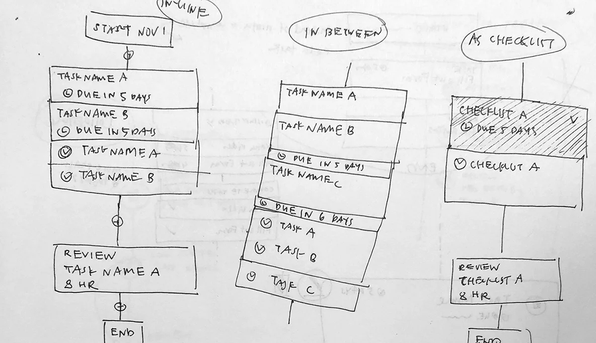

How did something so simple in my head turn into something so crazy on paper? And how was it that all the other automation builders out there didn’t run into the same problem? I realized that the problem was that most builders were usually only accounting for one or two instances of feedback from the user. They were mostly used to complete out-going actions that occurred in sequential order, but weren’t good at visualizing processes that were constantly checking for feedback from the user. When you started introducing tasks that were assigned at the same time but due at different times, with different overdue actions if completed late, you ended up with a giant mess.

I thought that minutely visualizing every decision would helpful and customizable, but I decided that in this case, clarity and simplicity was more important. Our users were already used to the concept of a task and deadline, we could just consolidate the task assignment, task completion, and overdue action.

Takeaways from those directions:
Templated structures - Instead of having the user start at zero, allow them to build on an existing process.
- Linear path with only a few options available - Instead of presenting them with limitless choices in limitless order, give them as few options as possible. I simplified the amount of building blocks drastically— reducing them from an original list of 22 to 3.
- Consolidating the more common, implied paths - Simplify the task assignment/completion paths into their own block.
User Interface
Card ITERATIONS

Simple process set-up


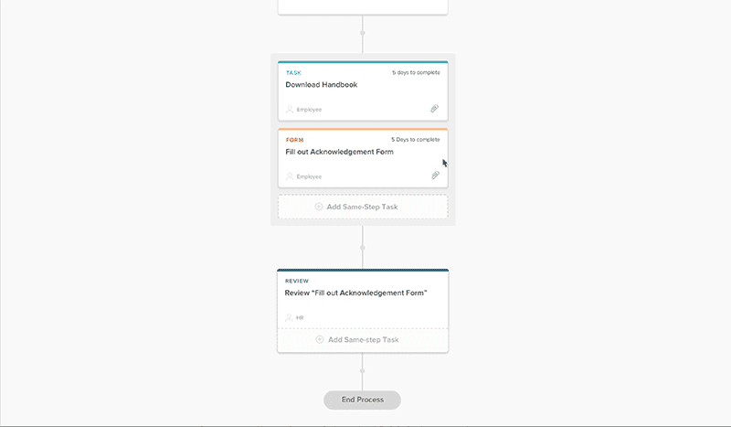
Adding a step in between.
Mid level Process— LIfe events template


Next Steps:
We’ve already completed the first round of usability testing, made corrections, and are ready to go into a second round with the same customers.
We’ve had to put this on hold for a bit as we work on other projects, but when we return we will continue testing, and then continue working on the other aspects of the product, such as the document storage and employee self-service portal. Lots more to come!


