VISUAL DESIGN, Illustration
HR Cloud Visual Refresh
This project was very much a joint effort between me and my fellow designer-friend, Kristy. This never really started out as a full rebrand, but we'd been thinking that we needed to visually separate HR Cloud’s style from its parent brand, Neogov. And up until this point, the illustration styles were very much the same.
We had only 2 weeks to finish this visual update as the team needed a new website up in time for the conference.
Date
Spring 2017
company
HR Cloud
Visual Differentiation
We started by first defining how HR Cloud was different from Neogov— Neogov was the older, more buttoned-up parent company that focused on public sector HR Software, and HR Cloud was its younger, start-up offshoot that focused on private sector HR software. From there, we honed in on what set it apart.
Exploration and Refinement
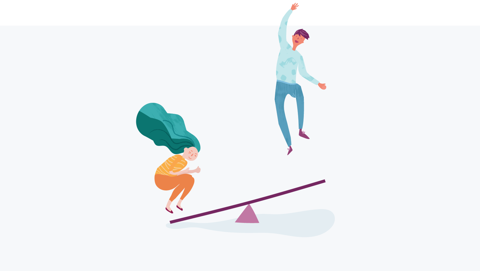
We then started pinning inspiration to a board individually and to our pleasant surprise, we saw that we were on the same page— lots of “naive” shapes with a bit of an amateur, hand-made feel; very human and very relatable colors and shapes in order to humanize our product and connect with our younger audience.
Pattern Exploration
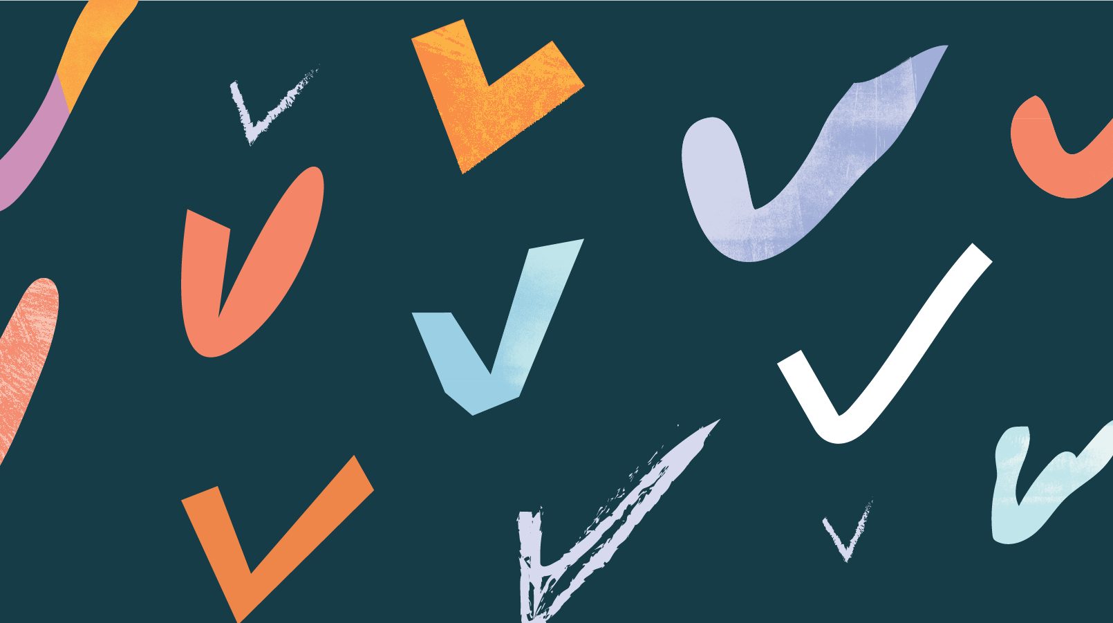
We also wanted a diverse and fun set of textures we could incorporate into the illustrations and backgrounds, but also have it serve as an easy backdrop for more sparse pieces of information. I loved incorporating them into our illustrations to soften up the harder lines. We had a ton of fun getting our brushes and fingers dirty, making some pretty cool paint textures that would later be used in different ways.
We came up this rule of off-setting the roughness of the textures with clean cut shapes (but that were a little bit “naive”-looking, to retain freshness and humanity).
Adding People
We decided that it was important to include human figures in our visuals as well to further establish rapport with the audience and make it easier to illustrate HR-related topics. We bouncing different styles off of each other, remixing bits and pieces.
One of my more final sketches.
Testing out different expressions and facial features with my designer/friend, Alex.


