
Branding, Visual Design, Illustration
Founded by Gil Ebaz, creator of Adsense, Factual is a company that specializes in the collection, cleaning, and distribution of data. Although they currently focus on location data, their long-term goal is to be the world's most comprehensive and trusted source of data and to make it accessible to everyone.
Challenge
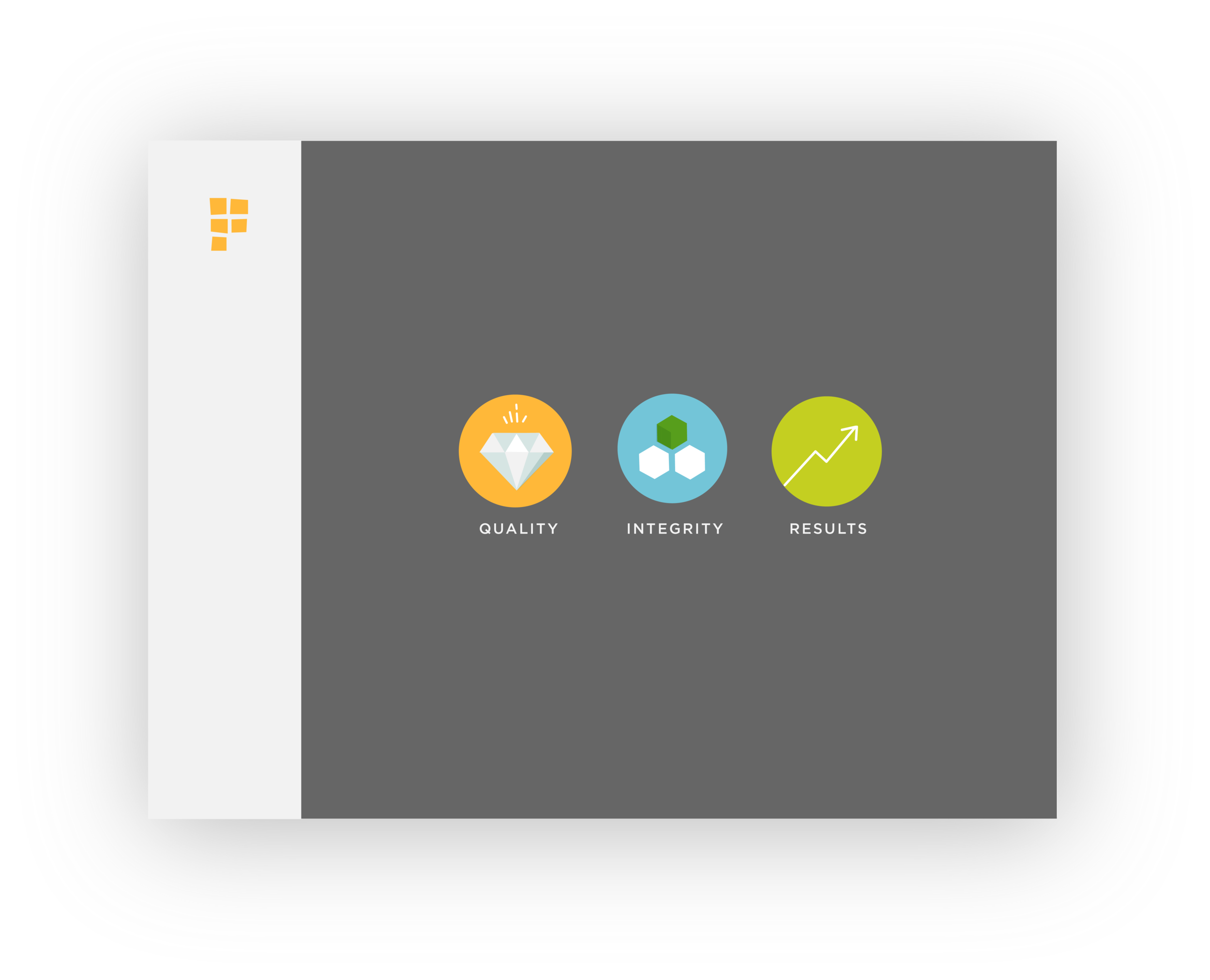
As the company was rapidly growing, there needed to be a strong sense of direction and unity. Without a solid identity as a foundation, employees weren't on the same page in terms of what we did and what our goal was.
With encouragement from our brand consultant, I approached the marketing director with this idea and was given the green light to put together a proposal. Only the logo was off-limits.
My starting point was the creation of the company mission statement by the executive team. With this document and employee research from our consultants, I drew out the core values and key attributes of the company.
PROJECT
Factual - Branding and Website
DATE
Spring 2016
CLIENT
Factual

Shapes
Next, I wanted to create a graphic representation of our data that could be used across all materials and act as the face of our brand. Since Factual's current focus was on global location data, I wanted it to a) be recognizable as data, b) convey a sense of universality, and c) be reminiscent of a globe.
To figure out what it would look like, it was essential for me to go to the root of what the company produced: data. I looked into what data in its rawest form looked like. One of the first forms of data used in engineering: punch cards.
I also looked into morse code as well as the microscopic grooves on a CD— a visual representation of binary code, the form in which computers store data.

"Factual" spelled out in punchcard.


I thought— wouldn't it be more meaningful if I could incorporate real data inside of this pattern? I looked up a binary code converter and started to manually transcribe the first line of the Factual mission statement into binary. The following shapes are the results of my experimentation.
"To be trusted stewards of the world's data."

Palette
Although some dispute the validity of color psychology, I thought it wouldn't hurt to align the colors with the core values of the company. The current palette's colors were okay on their own, but there were too many different variations floating across materials. I consolidated the colors into one palette that would be used across the board.
I also made sure to leave in the orange that our CEO dearly loved, but brightened it up and made it more fresh.